Sunday, April 30, 2017

Indigo Dynamo vs Auntie: the Director's Cut

Well, not really a "director's cut" per se but I just like that concept.

An anonymous commissioner enjoyed my recent Indigo Dynamo versus Auntie series (which was also a commission) but thought it needed a few scenes with more OOMPH, shall we say. So here are three decidedly naughty scenes to, ah, "flesh out" the serial. These first two occur after the original image #3:


The next one occurs after image #4, making this the last image in the series... for now, anyway, until someone commissions more or I get inspired to do something else with it. πŸ˜‰


Now for some test renders, as usual, to round out today's post. The Daz store had some excellent sales in April, letting me pick up a few things for dirt cheap. First up, a couple of new characters/figures. This lovely lass is called Dominique and she has a cute, winsome pixie/goth look to her.


Next is Sophie who is more voluptuous and has a very cute face. For some reason I was inspired to make her into a warrior elf, maybe because the character package included some wound overlays (evidence of which you can see below). I'm always open to suggestions so feel free to leave comments or send me a note at D.A. on how you think a particular character or costume might be used.


I like having a lot of different characters at my disposal in Daz Studio because it helps ensure that when I create a new character (whether it's from my own inspiration or a commission), he or she doesn't look too much like another existing character. Granted I have face and body morphs to assist with that but even so I think a discerning eye can spot the similarities.

For example someone recently noticed that I used the same figure for both a character named Adah in a short commissioned series as well as for my OC villainess Whiplash. 😳 I usually try to avoid that sort of obvious overlap, but at the same time I want to get the most out of these figures I've purchased. As far as I knew Adah was a one-shot character (though her commissioner is thinking of doing more with her, so that may not be the case), whereas I will be featuring Whiplash quite a bit in my images (she's already shown up in Raiders of the Lost Eye). And my pinup image of Whiplash (link above) inspired fellow Deviant Centrilia to feature her in an image for my April Art Contest.

And of course besides new characters I also obtained some costumes, all modelled for us, as usual, by the lovely and beguiling Candy/Duster. I have several ideas on scenarios to use these in my full images over time. For example, the first image below (the swimsuit with the flames on it) could be a sexy outfit for either a new superheroine or supervillainess. The others might be worn by any of my female characters on a sexy night out (or a sexy night in, depending), or a supervillainess might force them to wear it for the humiliation factor. For now they exist in a "clothing test" folder that I can conveniently browse through when looking for an outfit.


For those who are interested, my commissions are used for these content acquisitions. I don't spend everything I earn from commissions on digital content, but I have a rule that I only buy this sort of stuff with my commission income. That way I'm not loading up my credit card, which I don't like to do. So if you've commissioned artwork from me you've also helped me create even more images besides the ones you paid for. So thank you again!


...and that's it for now!

Sunday, April 16, 2017

Duster and Amazon Arrow vs Mistress Winter Part 3 and more!

First off, many of my Deviant Art watchers have indicated they wanted to see a continuation of the two-image pseudo-series I created a while back starring Duster, Amazon Arrow, and Mistress Winter. They were both pretty popular since those three characters won, respectively, my "Favourite Night Watch Hero", "Favourite non-Dangerguy OC", and "Favourite Dangerguy Villain" polls. Here are links to the FIRST and the SECOND image. And below is the third.


Obviously this goes beyond D.A.'s community guidelines, but even if I shifted the camera angle so it merely teasingly traipsed along that line I'd still post it here for reasons I've explained in a previous blog entry

Will I continue this series? Probably, I have a few ideas for maybe just one more image, but you'll have to be patient. I have several other series and commissions on the go.

Now to round out this blog entry here are some test renders of various costumes in my collection that I'll hopefully find a use for in future artwork.

First off, this is a fantasy outfit that I got on sale at the Daz store a while back called "Lady Darkness":


Yes that's Candy/Duster looking all sexy and villainous. I'm not saying I'm going to turn her into an evil sorceress, but dang, she makes a good one.

Here are not one, but two different school girl outfits. Though as someone recently pointed out to me, anyone wearing an outfit like this to just about any school on the planet would be sent home and told to change. Well, except for stripper school, I guess...


The one on the left looks more punky while the one on the right looks a little more innocent to me. Not, y'know, totally innocent... just relatively speaking. And let me just make it clear that Indigo Dynamo is definitely over 18 years of age!

Now a few new fantasy outfits. I'm going to try to use these in my on-going Raiders of the Lost Eye comic at some point. 


And that's it for now!

Saturday, April 08, 2017

Thoughts on Extremes of Various Kinds

Here's another scene from my new superheroine-in-peril novel, Game Theory:


Now some of you might be thinking that I could have posted that on my Deviant Art page and you're probably right. I've certainly seen images at D.A. depicting scenes that are much more violent, graphic, bloody, and just plain dark (and I don't mean just the light level). In fact so far from what I've been told and have been able to discern there are two principal image elements that will violate D.A.'s guidelines: penetration (vaginal or anal) and/or an erect penis. 😲

(After thinking about it a bit I came to understand that last one. Nothing else really constitutes as much of an obvious "ready for sex" signal. After all nipples can get erect just because it's cold out. Whereas a penis gets that way for one main reason—overly tight jeans notwithstanding.)

(Strangely though, speaking as a heterosexual and not really homophobic male, the sight of an erect penis has never bothered me. It's flaccid ones that gross me out a bit, but those are a-okay at D.A. So as a result I've see a lot more of them than I ever wanted to…)

(And one last thing… I've never liked that word "penis". Dunno why but it just sounds gross. Dick, prick, cock, phallus, shaft, member, manhood, Johnson, purple-helmeted warrior, one-eyed trouser snake, heat-seeking moisture missile… all fine. But "penis"? Ugh. Go figure.)

Anyway yes I could have posted this one at D.A. but I chose to put it here not out of fear of the slender chance of violating D.A.'s guidelines but out of deference to my watchers. As I've posted more erotic art and I've gathered more watchers and received more feedback I've noticed that some of my images don't always rub people the right way. (Go ahead and insert your own joke there. πŸ˜‰) That's to be expected; everyone has slightly different tastes, preferences, kinks, fetishes, and especially limitations. By creating and sharing erotic content I'm bound to push some people's buttons both positively and negatively. But in general I think my most successful images at D.A. have something lighthearted about them. Either I've tried to insert some humour or there's just something ridiculous and over-the-top about the situation. (Which is not hard, frankly, when you're depicting people with superpowers who wear colourful costumes as they fight crime.)

I think those elements of humour and whimsy provide a sort of comfort zone for most of my watchers. It makes an image with sado-masochistic elements safer because it's obvious it isn't real and that you're not supposed to take it seriously. But some of my images (especially a lot of those that illustrate my stories, which tend to have more extreme elements in them) are not depicted humourously and they also aren't inherently ludicrous. In fact I try to make my stories as realistic as possible (despite the fact they're about people with superpowers), so it follows that illustrations of scenes from those stories would also be realistic—perhaps even disturbingly so. As a result many people comment on how much "darker" those images seem compared to my other ones.

Now I don't want to limit my inspiration and I know just as many people really like those types of images as don't. But the thing about D.A. and its notifications is that if you're watching someone you don't have a lot of choice in what you're going to see. A thumbnail of every image they post appears on your notification page. Even if you want to see it, you might need a moment to mentally brace yourself to experience a "harder" type of image. But that automatic thumbnail doesn't give you that chance.

So posting those sorts of images here on the blog is a better compromise. I can alert my watchers to their presence with a status update: text only, so no unexpected visual surprise. And even if you want to come here and see the image you have a chance to take a moment and just mentally prepare yourself for something stronger than you'd normally see at D.A. I think that's valuable and important. As a result from now on I'll try to post images of a "darker" nature here even if they would pass muster at D.A. Of course I'm relying on my own judgment so I can't promise I'll make the right call every time. Still, doing the right thing sometimes is better than never doing it at all.


Another thing I thought I'd share (as it may have gotten lost in the D.A. comments where I posted it the other day) is that, in case you didn't notice, my Duster figure is significantly buffed up in these Game Theory images. That's deliberate; Game Theory stars an "elseworlds" version of Duster who becomes more of a hardened, ruthless, determined vigilante. The commissioner who requested the story wanted her to be slightly more muscular, which is how I described her. So of course that's how I depicted her in these images to be consistent. Below is a quick comparison render with Game Theory Duster on the left and "Duster Prime" (the figure I use in all my other artwork featuring her) on the right.


Duster Prime is still toned and athletic (a fact many of you have noticed and commented upon before), but for GT Duster I increased her muscle tone a bit and amped its definition a lot. It's most noticeable in her abdominals and thighs, and if you look closely you'll also see differences in her calves, arms, and so on.

Of course I could have gone further but I don't have a muscle fetish. Like most other fetishes I've got nothing against it but I prefer women to still look "feminine". I realize that's a loaded term we could argue about and I admit its perception is subjective. To me it means there must still be some "softness" in the figure. I prefer to not see so much musculature that the woman starts looking like a man in many respects. The Game Theory Duster figure I created for these images was my attempt to achieve a balance between muscularity and femininity that I could live with.

Anyway that's probably it for the Game Theory images (aside from one more going up on D.A. tomorrow). I created a total of fifteen images to promote the book, sixteen if you include the Duster figure that EXitZero included for the cover. Game Theory is selling well; it's been out just over a month at this point and it's already sold as many copies as each of my other books with the exception of Harem. I think the image-based promotional campaign helped in that regard. Which makes me think I should go back and do some of the same for my older books, so watch for that in the future.

Thursday, April 06, 2017

Games, Ghosts, and More

Some of you may know about my abortive attempt to leverage Patreon to start earning some money for my more boundary-pushing adult material. But it turns out that Patreon has some very definite boundaries themselves (which I only found out about by delving down the rabbit hole of their fine print; my thanks to a fellow deviant pointing it out).

I don't like taking unnecessary risks and I especially don't like doing that with other people's money. My nightmare scenario was to receive several monthly pledges at Patreon only for their Powers That Be to shut me down, leaving my patrons without the content they'd been promised after they'd all ponied up the cash for it. I'm reluctant to trust businesses or especially web sites that can ultimately be impersonal and may be operating well outside its users' legal jurisdictions to do the right thing. Which in this case would have been issuing refunds. Furthermore just as I respect individual's boundaries when it comes to adult material, I feel obliged to extend that respect to web sites too (however reluctant I may feel about it).

So long story short for the time being this blog lives on! I am developing an adult comic that continues the Indigo Dynamo story you can find at D.A. and here; that may end up somewhere like HipComix. But for now, my more risquΓ© one-offs will see the light of day here.

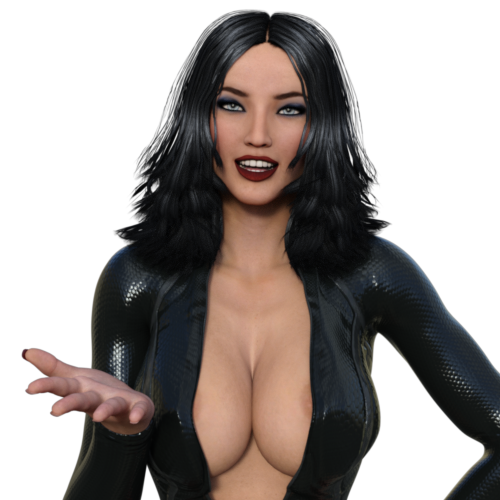
Speaking of which, here are a couple of images that I was going to post at Patreon. Their loss is your gain! First up is another image to promote my latest superheroine-in-peril novel, Game Theory.


As much as I enjoy writing these scenes it was fun this time to be able to bring some of them to life visually as well. Of course I am somewhat limited by my digital content and my own skills with it (though sometimes I made minor modifications to the prose in such a manner that I knew I'd be able to illustrate it in Daz Studio). I was going to go back and create a bunch of illustrations of my other novels and story collections for Patreon. That still may happen, but with less frequency. You can see some previous attempts at this in the sub-folders of my "Duster by DG" folder at D.A.

Below is an image that continues the brief series featuring Duster and voodoo master Monsieur Mort. Part 1 is at D.A. and Part 2 is here on the blog.


(Side note: I delayed creating this image until I could buy the content responsible for those creepy floating spirits. I think they turned out great! Of course I always try to justify buying content by using it more than once, but these guys look so amazing they'll be sure to reappear in some form or another in future images.)

Could this image have been posted at D.A.? Probably. I have seen plenty of limp dicks in illustrations there (way more often than I really wanted to, truth be told). But as I've said before, why take chances? Frankly D.A. is rapidly going from a site for R-rated to PG material for me, especially as a lot of the content my commissioners ask for tends to be much "softer". I have no problem with that; in fact that's why I write superheroine fiction rather than just straight porn. I like the action, the peril, and, yes, the character development too.

Speaking of commissions, and creating digital art in general, I thought I'd share some more process info for those who are interested. Recently, Tuckerverse commissioned me to create a series featuring his Arcader Agency beauties. Since those girls use time-freezing powers and/or technologies to capture supervillains, I had to work out a way to display that in images where everything is already frozen in time—because, after all, it's a still image. A discussion with Tuckerverse led to my using monochrome for this. However that complicated the rendering process because part of the image would now be black and white and part of it in colour. Here's how I accomplished it, demonstrated with an image from a new Arcader Agency series that Tuckerverse has commissioned.

First off I create the complete image. I usually render a smaller, lower-quality version of an image I'm working on. It only takes a few minutes compared to the hours (yes, hours!) required for a large, HQ version. That way I can check things like shadows which don't appear in the Daz Studio workspace. Sometimes little mistakes are more obvious in a render too, so if I spot any I go back and fix those. In fact shadows often make mistakes for obvious—for example, if someone's feet don't quite connect with the floor. And like a writing draft, sometimes I just see things that could be improved.


Once I'm happy with the full image it's time to separate the elements that will appear in colour from those that will appear in black and white. I actually have to plan this when creating the image as this means there will be at least two images, one layered on top of the other (almost always the mono image over top of the colour one). 

So for example in the image above I moved Tasia Spiro (the sexy blonde with the plunging neckline) so she didn't overlap with the figures on the cart (Mistress Winter and Min Yin). Of course I could have overlapped them provided she was behind them. Or if I wanted her in front that would mean I'd have to perform three renders, one of Tasia, one of the cart and the two figures on it, and one of the room by itself. 

But it's best when doing this to render and combine as few different images as possible. The reason is that the Iray render engine I use tries to realistically depict the way light works, which means it takes account of the fact that light bounces around off of practically everything that isn't absolute black. This is why you can see under your desk even though there's no light shining directly in there. For digital art his means that if you combine different renders together, the result almost always looks a little off because the light and shadows don't look quite right because they didn't get a chance to bounce light off each other and/or create proper shadows when rendering. The more elements you're combining, the more obvious this becomes, and the less realistic the image looks. 

(One image where I had to compensate for this was the first Duster vs Monsieur Mort picture I mentioned above. With that one Duster wouldn't render properly unless I put her off on her own, but that meant her feet and their shadows (or lack thereof) didn't look right when I combined her into the image with the villain and the environment. I got around that by adding some eerie fog to the bottom of the picture. Clever, eh? 😎)

I also have to consider how light sources will project into the scene. For example a light to the left will project a shadow from Mistress Winter onto Min Yin, but that shadow will not appear on either Tasia or the floor because they'll be rendered without Winter in the scene. 

So once all that's considered I create two new files, one with the colour elements...


...and another one with the elements destined to become monochromatic. It's very important not to move the camera in either file!

You might notice I cheated a little and put the cart in twice. That's so that it casts shadows onto the floor in the first image and so that Winter and Min Yin cast shadows onto it in the second. Fortunately it's predominantly grey so it's pretty much unnoticeable in the final result.

The graphic software I use to combine the images is GIMP, which is very flexible, powerful, and, most important of all to someone of Scottish heritage like me, free. (If I used Photoshop the process would be similar.) Each image is opened as a different layer in GIMP with the B&W one on top. I then select that layer and use GIMP's Color/Desaturate option to turn the colours in the second image into shades of grey. Fortunately the Desaturate dialog has a preview option which allows me to experiment and discover which of its three settings (Lightness, Luminosity, or Average) will give the best result.

I save the combined image as its own .PNG file then I reopen that and proceed with my usual postwork to enhance the brightness, contrast, sharpness, and so on. Then I export that to a "Postwork" image.


After that I import the file into Comic Life 3 and add the text boxes, word bubbles, sound effects, my logo, and what have you.

In this case, however, there was one more element to render and add. To further underline the notion that this is an instructional video being narrated by Arcader agents Tasia Spiro and Petra Wolf, I placed small images of them in the upper left corner beside the narration text box. To get those inserts I loaded the figure (Petra in this case) into a separate Daz Studio file and rendered her alone.


Yeah, I thought you'd enjoy a larger version of that image. πŸ˜‰

Because these single-figure images will be so small in the final result I don't bother with things like lights; I just use the "dome" lighting in Daz Studio which comes from an unseen image that wraps around the 3D environment and its figures. In addition I don't bother with any postwork. The resulting render is a .PNG file without a background which means that aside from the figure it's transparent. On a related note, while my final version of an image is always a .JPG file, my working images are always .PNGs mainly because I find that any transparency in the image works better with that file type.

Once all the elements are in place I have Comic Life export it as a .JPG image file. That leaves one final step before posting it. I almost always render images one "size" larger than their final version. So for example this image is 1920x1440 in its final form, but the working files (.PNGs again) are 2560x1920. I load the .JPG into GIMP one last time and scale the image down. Why? Because one of the first pieces of advice I received was to always render larger and then reduce the resolution. This helps improve the visual quality of the image by eliminating a lot of the "fireflies". These are the one-off bright pixels you sometimes see in a dark area that look out of place (results of Iray trying to bounce light around "realistically" again). There are other ways to get rid of them, granted, but reducing the file often does a nice job because it will usually look at the "average" brightness of the pixels in an area and adjust them accordingly when reducing the resolution. I have chosen an image width of 1920 pixels as my standard because it makes for a reasonable .JPG file size for storing, posting, uploading, and emailing. It's also the width of my PC monitor which means when I max out the size of the image it fits perfectly... well, horizontally, at least.

The final image resulting from all of this:


And that's all for now!